I've been making pixel art since the Flash days, and nothing separates amateur work from professional sprites like good texture work. You can have perfect colors and clean lines, but without proper roughness and surface detail, your art looks flat and lifeless.
The secret isn't complex dithering patterns or fancy brushes — it's understanding how real materials break light and applying that knowledge pixel by pixel. Let me walk you through the exact process I use to add convincing texture to any surface.
Check out the video above for a visual walkthrough — I'll break down the key steps below with extra tips from my own experience working on indie game projects.
Understanding Surface Roughness
Before diving into techniques, you need to think like a material. Smooth surfaces reflect light uniformly, while rough surfaces scatter it in multiple directions. In pixel art, we simulate this by varying our highlight and shadow placement.
I'm demonstrating these techniques in Aseprite (my go-to), but the principles work in any pixel editor — Pixelorama, LibreSprite, even GIMP with the right setup.
Step-by-Step Texture Process
1. Start With Your Base Shape
Create your basic form using flat colors first. Don't worry about texture yet — nail the silhouette and basic shading. Set your canvas to a comfortable working size (I usually start at 64x64 for practice pieces).
Use RGB color mode and work at 100% zoom to see exactly how your pixels will look in-game.
2. Establish Your Light Source
Pick a consistent light direction and stick with it throughout your piece. I typically use top-left lighting (classic game art convention), but the key is consistency.
Add your basic highlights and shadows using traditional pixel art shading techniques. This gives you the foundation to build texture on top of.
3. Break Up Large Flat Areas
This is where texture starts. Large flat surfaces scream "amateur" in pixel art. Even the smoothest real-world materials have some variation.
Start by adding tiny variations in your base color — maybe 1-2 shades lighter or darker, scattered randomly but not uniformly. Think of this as surface imperfections catching light differently.
Pro tip: Use Alt+click to sample colors directly from your canvas. This keeps your variations subtle and cohesive.
4. Add Directional Patterns
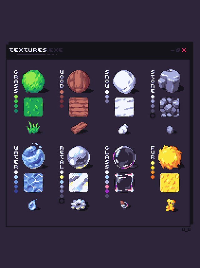
Different materials have different grain patterns. Wood has linear grain, stone has irregular cracks, metal has brushed or hammered textures. Study reference photos and abstract the patterns into simple pixel arrangements.
For wood: Create thin, wavy lines following the grain direction
For stone: Add small, irregular dark spots and cracks
For fabric: Use crosshatch patterns or woven textures
For metal: Add subtle parallel lines or dimpled patterns
5. Vary Your Highlight Intensity
Here's something most tutorials skip: rough surfaces don't have uniform highlights. Some areas catch more light than others due to surface irregularities.
!r/PixelArt - [tutorial] Wood floor texture pattern
As the folks at SLYNYRD point out, avoid emphasizing every detail with outlines — it gets busy fast. Instead, add occasional shadows or highlights on select elements for that rougher look.
Use your brightest highlight sparingly, saving it for the most prominent surface features.
6. Create Depth With Micro-Shadows
This technique separates good texture work from great texture work. Add tiny shadows in crevices, under raised areas, and anywhere surface irregularities would create small pockets of darkness.
These micro-shadows should be subtle — often just one shade darker than your base color. They create the illusion that your surface has actual depth and dimension.
Pro tip: Zoom out frequently (Ctrl+0 in Aseprite) to check that your texture reads well at actual size. Details that look great zoomed in might disappear at game resolution.
7. Test Against Different Backgrounds
Your texture might look perfect on a transparent background but fall apart against game environments. Test your work against various background colors — especially the colors you'll actually use in your game.
Create a new layer, fill it with different background colors, and see how your texture holds up. Adjust contrast and edge definition as needed.
8. Add Contextual Wear and Aging
Perfect surfaces look artificial. Real materials show wear patterns — edges get worn, corners collect dirt, high-contact areas get polished smooth.
Add these details strategically:
- Rounded corners on hard materials
- Darker accumulation in crevices
- Lighter wear on protruding edges
- Stains, scratches, or patina where appropriate
Pro tip: Less is more with wear effects. One or two well-placed details beat scattered damage everywhere.
Advanced Roughness Techniques
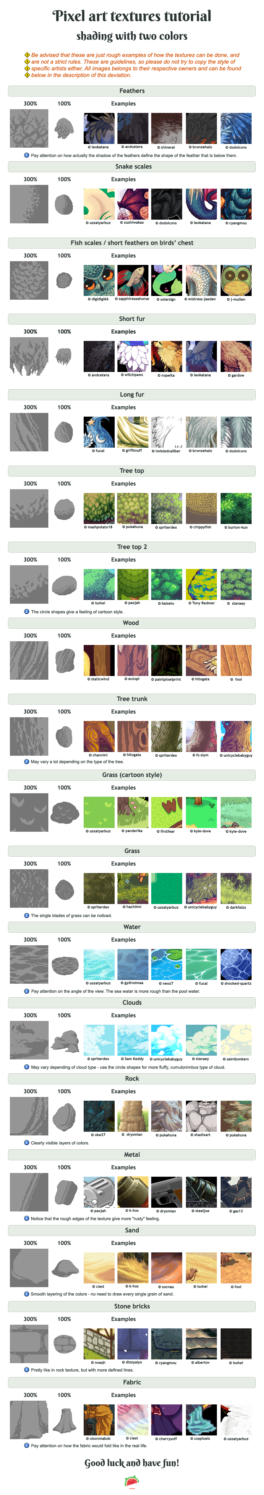
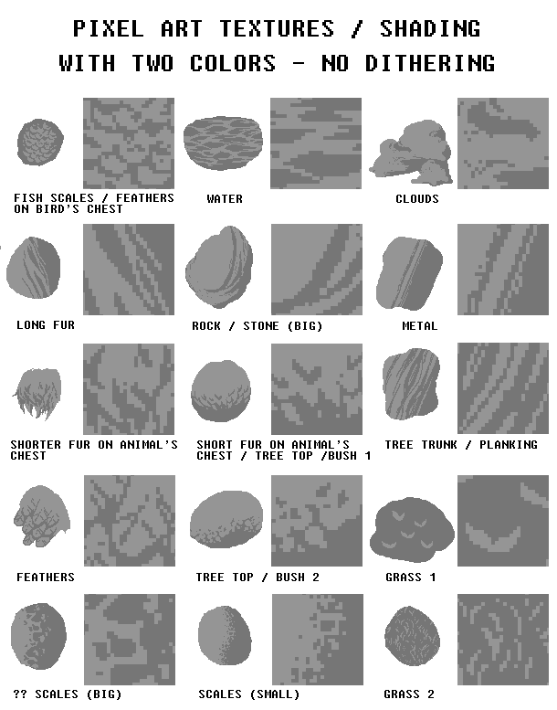
Pattern Complexity and Roughness
As noted in the pixel art tutorial community, the nature of the pattern totally changes the roughness aspect. Complex textures combine multiple fundamental patterns — you might layer wood grain with surface scratches and edge wear.
Start simple and build complexity gradually. Each layer should serve a purpose in selling the material's story.
Scaling for 3D Applications
If you're creating textures for 3D models, the gamedev community on Reddit suggests a clever trick: upscale your texture 8x or 16x without filtering, then enable bilinear filtering and mips. This preserves the pixel aesthetic while providing smooth edges in 3D space.
Common Mistakes to Avoid
Over-Dithering Everything
Dithering isn't automatically good texture. I see beginners apply checkerboard dithering to every surface, creating visual noise instead of convincing materials. Use dithering sparingly, and only when it serves the specific material you're depicting.
Ignoring Light Logic
Texture details should follow your established lighting. If your main light comes from the top-left, surface bumps should have highlights on their top-left faces and shadows on their bottom-right faces. Breaking this consistency ruins the illusion.
Making Everything Too Busy
Not every pixel needs detail. Smooth areas provide visual rest and make textured areas more impactful. Balance detailed regions with simpler ones.
Forgetting the Pixel Grid
Work with your medium, not against it. Trying to create sub-pixel details or anti-aliased curves often looks worse than embracing clean, grid-aligned shapes.
Inconsistent Texture Density
If one object has heavy texture detail, nearby objects should match that level of detail density. Mixing highly detailed textures with flat surfaces creates visual hierarchy problems.
Putting It All Together
Mastering texture in pixel art takes practice, but these fundamentals will get you started on the right path. Focus on understanding your materials first — how they interact with light, what makes them unique, how they age and wear.
The Pixel Joint community has ongoing discussions about texture techniques if you want to dive deeper into specific materials or get feedback on your work.
Start with simple materials like wood or stone, nail the basics, then gradually work up to more complex surfaces like weathered metal or organic materials. Each material you master makes the next one easier to tackle.
Remember: good texture work isn't about cramming in every possible detail — it's about choosing the right details that sell the material's story in the fewest pixels possible.